They say you shouldn’t judge a book by its cover, but some of your potential readers will, and you don’t want them wincing at the sight of your book. Today we’ll be judging covers, or at least reviewing what makes a good one.
After you read this post, please check out Derek Murphy’s take on cover design here. He goes into more depth. Although I’ll only be discussing fiction covers, his post also addresses non-fiction.
Resources
Where do you get cover art? Here are some sources:
- If you sold your book to a publisher, the publisher may do your cover. They will likely work with you and do their best to accommodate your preferences.
- If you’re also an artist or graphic designer, you can make your own cover art. If you’re manipulating images found on-line, be careful not to violate public domain restrictions. Sites like Dollar Photo Club and Dreamstime offer thousands of images at reasonable prices.
- You can pay someone to do your cover art for you. Perhaps you have an artist friend, or you can get in touch with a talented artist at a local high school or college through the art department. There are websites such as 99Designs where you can have artists compete to make your cover.
Techniques
Derek Murphy’s post spells out the secrets to good book cover art in detail, but his overall message is that people will only glance at a cover for a moment, so it has to grab them. Your cover has to convey its message in a couple of seconds. All eight of Murphy’s cover design secrets flow from this principle. I’ll discuss each technique with respect to the covers of my books, or anthologies in which my stories appear.
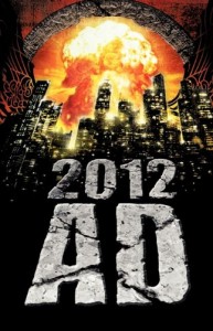 1. Make it “Pop.” Use contrast between light and dark, or opposing colors. The cover of 2012 AD uses that technique to show off the explosion.
2. Lots of space. Avoid clutter. 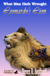 The cover of “Leonardo’s Lion” is simple; the reader’s eye doesn’t have to wander all over to get the point.
 3. Make it emotional. Your cover should be beautiful; it should appeal to the heart and make readers feel something. Remember, readers of different genres react emotionally to different things. The cover of “A Steampunk Carol” has the brass gears that steampunk lovers enjoy, and adds the red and green flowers of Christmas.
4. Use a subtitle, teaser or tagline (and a review!). It’s an effective technique, but none of my covers so far have used this.
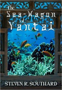 5.
5.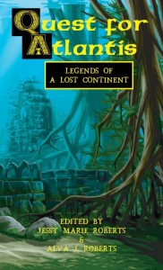 Pick the right font (and effects). The font should be readable and should help deliver the book’s message. In Quest for Atlantis, the main title font has an ancient (or at least olden) look. For “The Sea-Wagon of Yantai,” the title font has an Asian feel.
 6
6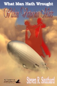 . Make it personal (but not cheesy). It’s good to have people on your covers, though Murphy argues against silhouettes. “Ripper’s Ring” gives you a glaring Jack the Ripper. We did use silhouettes for “Within Victorian Mists” but I think we did it effectively, to convey dancing on clouds.
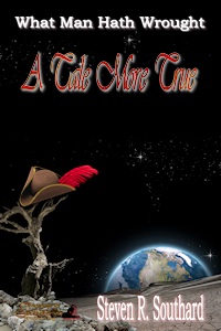 7. If it’s too hard, go simple. Murphy argues against trying to cram in all the ideas you’d like to convey. I think “A Tale More True” illustrates a reasonable amount of simplicity. The reader has to wonder how a tricorn hat ended up there.
![Pageflex Persona [document: PRS0000039_00001]](https://stevenrsouthard.com/wp-content/uploads/2015/10/HidesTheDarkTower-DigitalCover-FINAL2-200x300.jpg) 8. A little more on text placement. Murphy makes some additional points about text contrast with background, as well as fitting in short words (a, by, in, or the) in among the larger words. I like how the tower in Hides the Dark Tower seems to punch through the word ‘tower.’
8. A little more on text placement. Murphy makes some additional points about text contrast with background, as well as fitting in short words (a, by, in, or the) in among the larger words. I like how the tower in Hides the Dark Tower seems to punch through the word ‘tower.’
As writers, we’re not expected to be great cover designers. If you are, or would like to be, then more power to you. For the rest of us, we must depend on (and pay for) the skill of others such as Derek Murphy. Leave the judging of book covers to the experts; that’s the advice of—
Poseidon’s Scribe